
Sunday, 5 October 2014
College magazine analysis
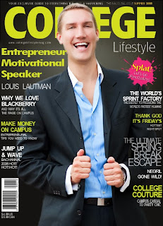
This magazine has a dark background with a male model in the middle and yellow and white font colour.
The model is smartly dressed with a shirt, a blazer, a watch and combed hair. He looks like he is laughing and is very happy which makes it look like the magazine could be fun which entices the students to want to buy this magazine. The yellow and white font stands out against the smart black background. The Masthead also looks smart and stands out due to how bright it is. There is also a contrast between the yellow against the black. This college magazine is most likely to be a Cambridge or oxford magazine due to the overall smart layout. The cover lines stand out using a range of fonts but mainly bold this attracts attention to them and underneath there is smaller writing this is because they are not as important. There is a pink splat which represents paintballing which is what it is advertising, inside the splat it says 'splat!' which is effective because it doesn't only look like a paintball has hit the front cover of this magazine, but it also makes the reader feel like they can hear it which makes it more realistic. The main cover line is in a large bold font and is the same colour of the masthead which is bright yellow and is taking up about a quarter of the cover area, placed under the masthead and next to the models face. This is where the reader's attention will be allowing them to see most of the important parts of the magazine, which will hopefully attract them to buy this magazine. At the bottom left corner there is the barcode and the price of the magazine and at the top right is the dateline, this is the standard format which makes it easy to find.
Subscribe to:
Post Comments (Atom)
No comments:
Post a Comment